Understanding The Color Wheel
Crafting is a form of art that allows for immense creativity and personal expression. One of the fundamental aspects of crafting that can significantly enhance the visual appeal of any project is the use of color. Understanding color theory and how to effectively combine pigments is crucial for any crafter looking to elevate their work. In this blog post, we will delve into the basics of color theory and provide practical tips for combining pigments in your crafting endeavors.
The Basics of Color Theory
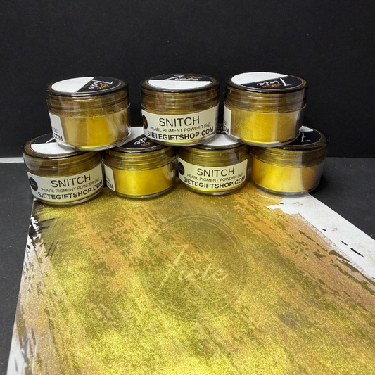
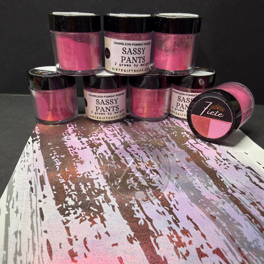
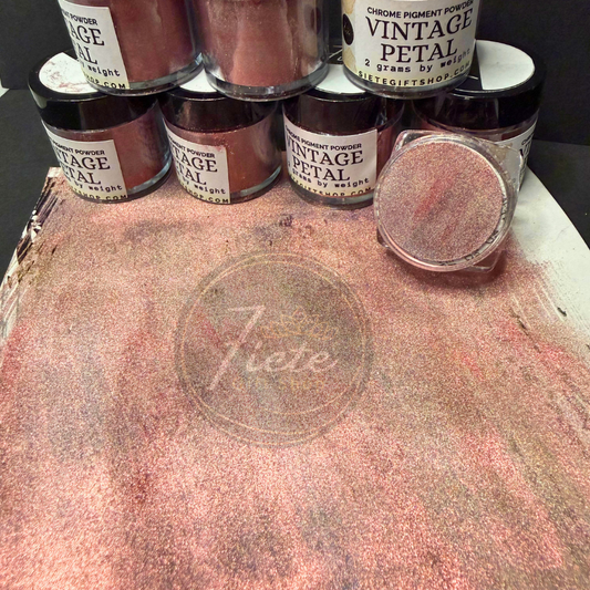
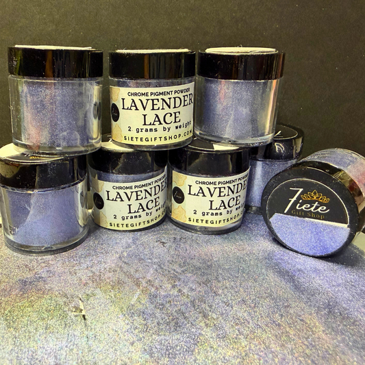
Color theory is a science and art unto itself, which explains how humans perceive color, as well as the visual effects of how colors mix, match, or contrast with each other. Colors are often organized on a color wheel and grouped into three categories: primary colors (red, blue, and yellow), secondary colors (green, orange, and purple), and tertiary colors (combination of primary and secondary colors).

Understanding the Color Wheel
The color wheel is an essential tool for crafters. It helps in understanding which colors complement each other and how they can be combined for maximum effect.
- Complementary Colors: These are colors that are opposite each other on the color wheel, such as blue and orange. These combinations are high contrast and high intensity, making them stand out.
- Analogous Colors: These are colors that are next to each other on the color wheel, such as red, orange, and yellow. These create a more harmonious and less contrasting look.
- Triadic Colors: These are evenly spaced around the color wheel and tend to be very vibrant, even if you use pale or unsaturated versions of your hues.

Mixing Pigments
When it comes to crafting, mixing pigments can be a bit different from mixing light. Here's what you need to know:
- Subtractive Mixing: This is relevant for paints, dyes, and inks. When you mix pigments, you're combining substances that absorb (subtract) different colors of light and reflect the others.
- Mixing Guidelines: Start with lighter colors and gradually add darker colors. Remember, it's much easier to darken a light color than to lighten a dark color.
Practical Tips for Crafters
- Experiment with Shades and Tints: Add black, white, or grey to your base colors to explore different shades (darker versions) and tints (lighter versions).
- Create a Color Palette: Before starting a project, create a color palette to see how your chosen colors work together.
- Consider the Mood: Different colors can evoke different moods. For example, blues and greens are calming, while reds and oranges are more energizing.
- Texture and Pattern: When combining colors, consider how textures and patterns can complement or contrast with your color choices.